
In today’s tech-saturated world, having a website is essential for any nonprofit or organization to connect constituents to their cause.
Nearly every other marketing initiative you use—be it social media, an e-blast, newsletters or annual reports—will push supporters to your nonprofit website, so you want to make sure the final destination is attractive, straightforward and easily navigable.
And since people tend to browse quickly and multitask on the web, you only have a few seconds to grab their attention and encourage participation.
While most nonprofits understand the value of online marketing, many aren’t sure where to start. Let’s look at 3 ways you can give readers the motivation and tools they need to support your cause.
Tip #1: Attractive Design and Branding
- Keep it simple. When it comes to site design, each organization has its own preferences: sleek and modern, colorful and kid-friendly. While design can reflect the nature of the organization, the general key to success is that “less is more.” Below, the homepage for the American Society for the Prevention of Cruelty to Animals is a great example of minimalism. They take advantage of negative space, guiding the reader to information and donations. A site that’s too cluttered, especially the homepage, can drown out your main message.

- Feature the most important content right from the homepage. This is particularly essential for time-sensitive events like fundraisers. Here, this Chicago nonprofit features upcoming events front and center with a landing page that draws the eye straight to this urgent information. With multiple upcoming events, they use a slideshow that can easily be customized as new events appear.
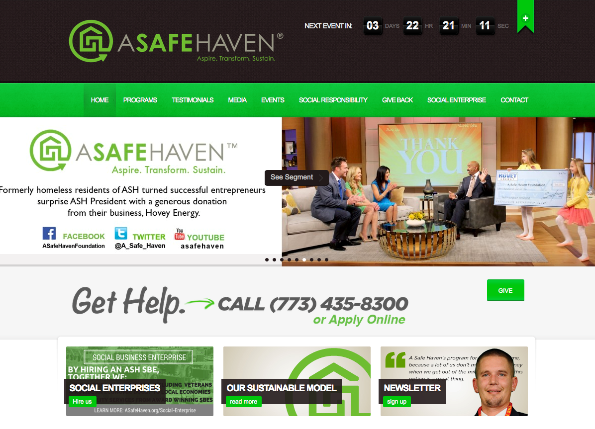
- Unify your brand with consistent color and font choices. This organization purposefully selected a bright shade of green for their logo to represent growth. Featuring that same vibrant hue throughout the site—on their banners, a prominent Give button, promotional materials and more—creates consistent, recognizable branding and an overall aesthetically pleasing vibe. The colors and font of your logo should be incorporated into the site; use sparingly but enough to make a visual impact.
 Optimize your nonprofit website to be viewed on mobile devices and shared on social media. Research indicates mobile visits now account for over 40% of all Internet traffic. Consider designing the site with mobile in mind. Avoid minuscule text and links, and try using Google analytics to feature only the most popular content.
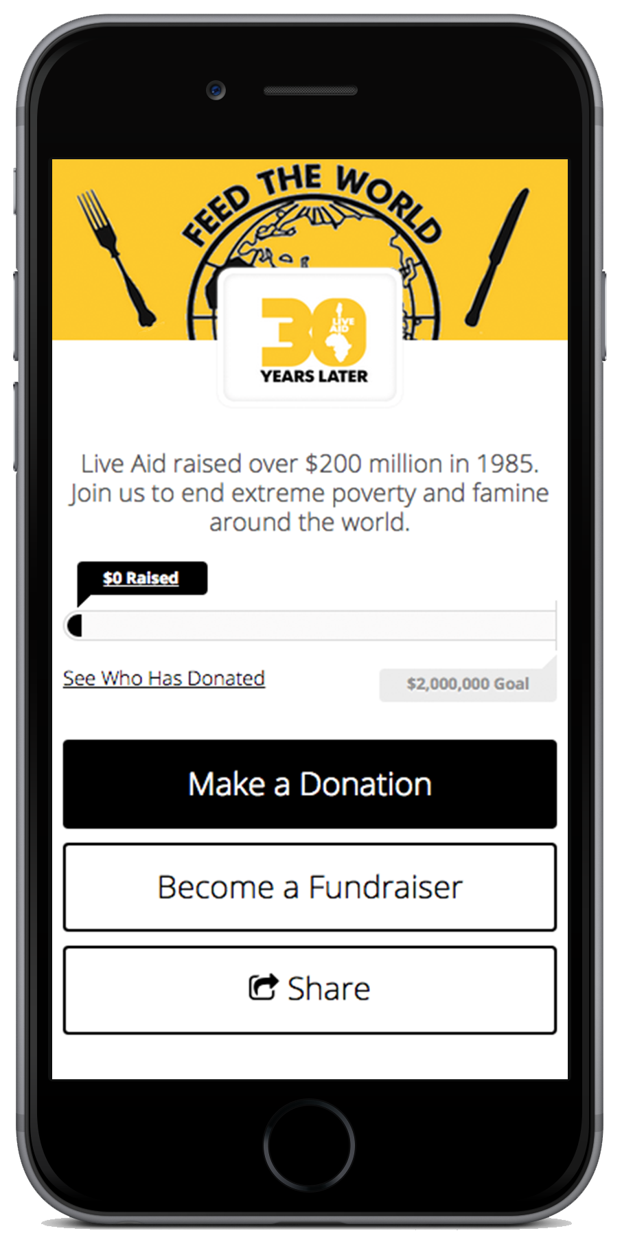
- Smaller nonprofits may want to optimize only the most important parts of the website for mobile viewing, like the “About Us” and “Donate” tabs. On the right, Feed the World highlights 3 easy action steps: donating, asking others to give, and sharing with social networks.
- Larger organizations may benefit from creating an entirely separate mobile version of the site.
Tip #2: Engaging, Organized Content
- Pair a concise mission statement with meaningful, artistic images. A picture of the people or communities you serve is worth a thousand words, and combining them with important information and clear calls-to-action will multiply the impact.
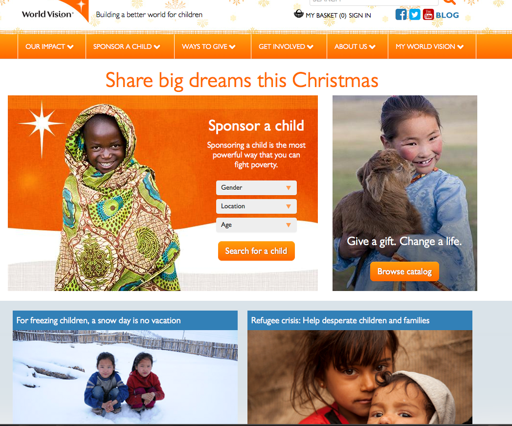
World Vision’s tagline, “Building a better world for children,” is supported by striking images of children from around the globe. When writing your own homepage description or tagline, think of how you’d describe your nonprofit in ten words or less. This will help people immediately identify your mission, plus increase the likelihood that they’ll find your site on the first page of search results. (For example, World Vision is one of the first results that pops up when searching for “child sponsorship.”)
- Feature interactive content, like a new video or annual report, on the landing page. Video can be uniquely helpful for sharing the mission of your nonprofit; it combines audio, visual and written communication to tell a well-rounded story. Keeping the video to a minute or less helps viewers stay engaged and ready to explore the rest of the site.
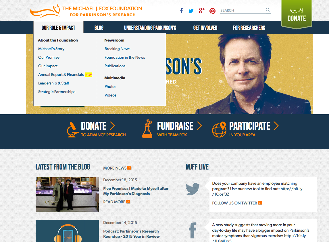
- Use navigational pull-down tabs and include a site map. For less urgent content, such as contact information or history of the organization, you still want the viewer to have easy access to that information. For example, the Michael J. Fox Foundation for Parkinson’s Research keeps a comprehensive navigational bar docked at the top of the screen. Research suggests a loss of 40% of visitors with each click, so be sure the menu is clear with plenty of drop-downs for organized storage.
- Consider creating a blog—and committing to post at least weekly. Featuring a blog on your website allows you to share moving testimonials of the impact of your work. This will increase your organization’s reach and impact, plus provide valuable networking opportunities with others in the industry.
- Having a separate page for media information or a “Newsroom” can also be helpful. Consider uploading profiles of your board of directors and key staff, contact information for media and a downloadable media kit or annual report. This way, journalists and reporters can quickly access information and potentially give you free coverage in their news outlet.
Tip #3: Clear, Compelling Calls-to-Action
- Make your site donor-friendly. Often people will visit your site for the purpose of giving; your site can also help solicit donations from potential donors that may have stumbled upon your site through a friend, social media post or web search. With that in mind, it’s critical to make the Give Now button accessible and located intuitively, such as in a docked header or sidebar. Make it as easy as possible to support your mission.
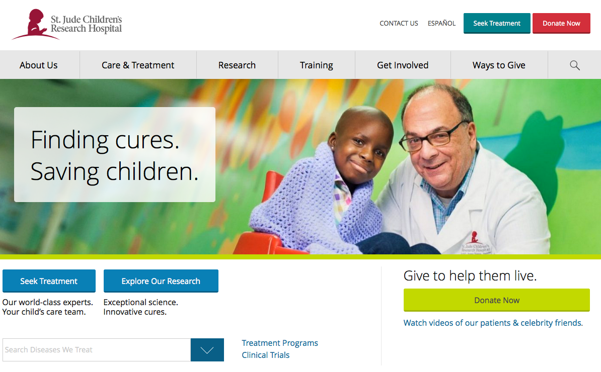
On the homepage for St. Jude Children’s Research Hospital, our eyes are drawn right off the bat to that bright green “Donate Now” button. The button is also placed under a concise and impactful tagline, “Give to help them live”: this draws a powerful connection between the donor’s action and the end result of saving lives. Once you click, the donation process itself takes as few steps as possible, preventing potential donors from leaving before they’ve finished the process.
- Help viewers sign up for your email lists quickly and easily. Your website is an ideal place to build your subscriber list, allowing interested parties to keep up with your organization.
- Display your nonprofit’s contact information (address and phone number) prominently, docked at the bottom of the page. The best way to build lasting relationships with your supporters is through phone or face-to-face communication, and showing you’re a real organization will increase their trust in giving money or contact information.


- Provide multiple opportunities to connect. World Vision places a quick email signup form at the bottom of the front page, then again in other parts of the site. Try to ask for only one or two pieces of information (e.g. name and email address) to ease any hesitance towards signing up.
We hope this post sparks some ideas to incorporate into your webpage, or gives a much-deserved pat on the back for what you’re already doing. The status quo for web design changes day by day, so don’t be afraid to experiment with new layouts and designs—you might be surprised at what works best!
Did we miss anything? Leave your own tips in the comments below.
{{cta(‘1a1cf4d1-a3b1-4e4c-8687-8512e667053f’,’justifycenter’)}}